Unlocking the Power of PMS: Your Ultimate Colour Chart Guide
Colour can evoke emotion, convey meaning, and create impact. Understanding how to harness colour effectively can transform any design, branding, marketing, or creative project. While most are familiar with standard colour models like RGB and CMYK, Pantone’s PMS system offers capabilities beyond the basics. Read on to unlock the full potential of PMS colours.
Demystifying PMS: How the Colour System Works
PMS stands for Pantone Matching System. It was first released in 1963 and is a standardised method for specifying, matching, and controlling ink colours. The PMS library consists of over 1,700 distinct solid shades. Each one has an assigned number and name to enable accurate identification, communication, and reproduction of the colour.
Unlike RGB or CMYK, which produce colours by mixing percentages of their primaries, each PMS shade has a unique ink-swirling formula. This enables precise colour control and consistency across different materials and finishing processes. It also allows accurate simulation of PMS tones in digital formats. Understanding PMS codes is vital for effective colour use across integrated campaigns.
Capitalising on PMS Colours in Design and Branding
PMS colours offer exceptional advantages in design work, branding, and production:
Precision Colour Reproduction
PMS allows designers to achieve reliable colour matches across different materials and between print and digital. This aids cohesive branding and quality control. Calling out specific colours using PMS codes and ink formulations streamlines printer specifications.
Expanded Colour Range
While RGB and CMYK rely on 4-6 primaries, PMS’s vast library enables access to greater colour breadth, including fluorescents and metallics. This increased spectrum suits the current towards bolder, more vibrant palettes. These shades can be complex to reproduce accurately without PMS codes.
Enhanced Colour Communication
PMS codes eliminate ambiguity when discussing or specifying colours. Rather than vague descriptive names, PMS offers standardised numerical identification directly corresponding to precise ink mixing formulae. This facilitates design discussions and streamlines approval processes.
Harnessing the Psychology of PMS Colours
Beyond their aesthetic and production capabilities, PMS colours also offer psychological influence. Associations, meanings, and impressions conveyed by different hues can significantly impact design effectiveness.
Boost Visibility and Recall with Vibrant Tones
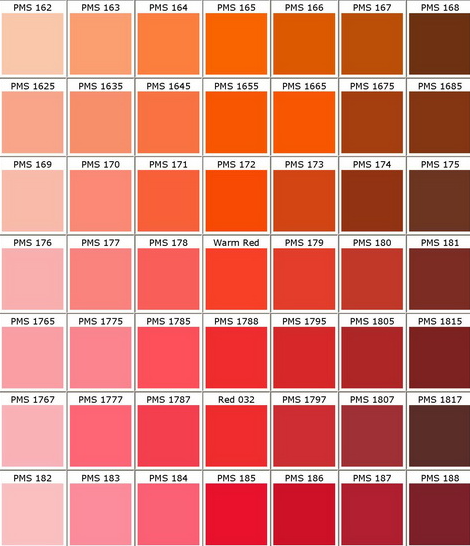
PMS contains a wide variety of bright, vibrant hues that are effective at garnering attention and memorability. Fluorescent colours like PMS 803 can enhance visibility across distance—others with an innate psychological presence, like PMS 1815’s “Fiesta” orange, test well for recall.
Influence Meaning with Tone Associations
Colours have cultural symbolism, with red conve1815’sx “item” or yellow signifying cheerful optimism. Even sub-meanings exist; lighter tints seem friendly and pastoral, while darker shades signal luxury. Layering carefully chosen hues builds desired associations.
Set a Desired Mood with Colour Psychology
Just as red excites and yellow lifts spirits, blue and green have calming effects associated with water and nature. Combining tones that align with a target mood shapes viewer perceptions. Anticipating psychological impact allows designs to guide reactions. By unlocking the benefits of the Pantone Matching System, designers gain exceptional creative capabilities for more thoughtful, strategic visual communication.
Whether seeking to match colours flawlessly across print and digital or convey precise psychological meanings, PMS provides expanded control through standardised codes and custom ink mixing. As a secret weapon long embraced by industry pros, employing PMS opens new doors for effective branding and impactful designs. The next time a colour choice arises, consult the PMS library and leverage its strengths to create captivating work that truly resonates. With some practice, skillfully wielding PMS colours will soon feel like second nature.
Start Applying PMS Colours More Creatively
PMS colours offer extensive possibilities beyond just decorating documents. By thoughtfully harnessing the exceptional advantages of PMS, designers gain precise control over colour reproduction and psychological influence. This expanded creative latitude empowers more impactful, intentional design.
The next project requiring attention-grabbing visuals or refined branding presents a chance to explore PMS colour selection more strategically—Reference Pantone’s online library and trend reports as rich sources of inspiration. Then, watch your designs come to life with new vividness and Pantone’s by incorporating the perfect featured PMS tones. Calling upon these colour superpowers will quickly become second nature with some practice.
Conclusion:
By unlocking the benefits of the Pantone Matching System and Pantone colour chart, designers gain exceptional creative capabilities for more thoughtful, strategic visual communication. Whether seeking to match colours flawlessly across print and digital or convey precise psychological meanings, PMS provides expanded control through standardised codes and custom ink mixing. As a secret weapon long embraced by industry pros, employing PMS opens new doors for effective branding and impactful designs. The next time a colour choice arises, consult the PMS library and leverage its strengths to create captivating work that truly resonates. With some practice, skillfully wielding PMS colours will soon feel like second nature.

