The Psychology of Color: Creating the Right Atmosphere in Your Home
Unlock the power of colours to transform your home’s vibe with interior painting! Ever wonder why some rooms make you feel calm while others energize you? It’s all in the colours!
Dive into the fascinating world of colour psychology and discover how the right shades can create the perfect atmosphere in your space. Choosing the right paint colours is crucial whether you’re aiming for a cozy retreat, a productive home office, or a vibrant gathering area. This guide will reveal expert tips and insights on selecting the ideal palette to enhance your home’s mood and aesthetic appeal. If you’re considering a home makeover and want to harness the power of colour psychology, enlist the expertise of Calgary painters.
Get ready to paint your way to a more beautiful and emotionally resonant home with our straightforward advice. Let’s bring your vision to life with colours that speak to you!
The Impact of Color
Understanding the psychology of colour is a fascinating journey that can significantly impact your home’s atmosphere and mood. Strategic interior painting can transform any space into an oasis that perfectly reflects your personal style and emotional needs.
Let’s explore how different colours can influence your home’s ambiance and provide practical tips for applying these insights to your next painting project.
1. Blue: Tranquility and Serenity
Blue is often associated with calmness and tranquillity. It’s an excellent choice for bedrooms and bathrooms where relaxation is key. Lighter blues can create a serene and airy feel, ideal for unwinding after a long day. Darker shades, on the other hand, add depth and can add focus in home offices or study areas.
2. Yellow: Happiness and Energy
Yellow, the colour of sunshine, is perfect for kitchens, dining areas, or any space where you want to evoke feelings of happiness and vitality. Its energizing hues spark creativity and can lift your spirits. However, choosing softer, muted yellows is important to avoid overwhelming the space.
3. Green: Harmony and Health
Green, reminiscent of nature, promotes balance, harmony, and renewal. It’s a versatile colour that works well in almost any room, especially spaces dedicated to relaxation or rejuvenation, like living rooms or home spas.
Light greens can make a room feel more spacious, while darker greens add a touch of sophistication.
4. Red: Passion and Appetite
Red is a powerful colour that can stimulate the senses, including appetite, making it a popular choice for dining rooms. It’s also associated with passion and energy, which can be perfect for entertainment areas. However, because of its intensity, it’s best used as an accent colour to avoid overwhelming the room.
5. Purple: Luxury and Creativity
Historically associated with royalty, purple brings a sense of luxury and creativity. It’s excellent for inspiring creativity in home offices or craft rooms. Lavender and lilac, softer variations of purple, provide a restful quality suitable for bedrooms.
6. Orange: Warmth and Enthusiasm
Orange is a vibrant, energetic colour that can bring a sense of warmth and enthusiasm to a space. It’s particularly effective in exercise rooms or playrooms with high energy levels. Using softer shades can help ensure the colour stimulates without overpowering.
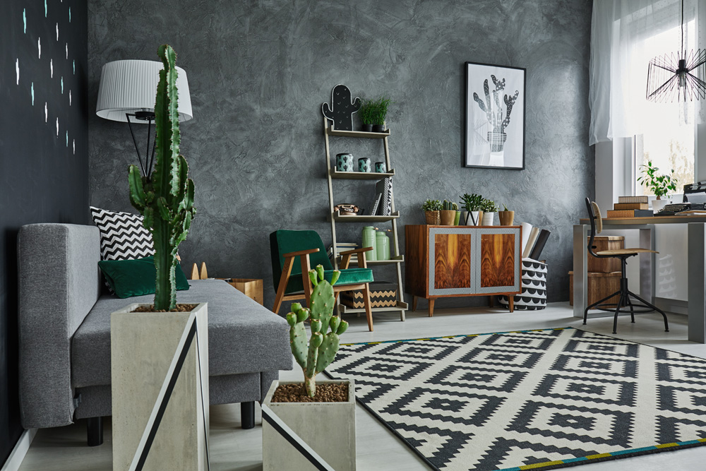
7. Neutral Tones: Flexibility and Sophistication
Neutral tones like beige, gray, and taupe provide a canvas that allows other elements in the room to stand out. They offer flexibility in décor and create a sophisticated backdrop that can make your furniture and artwork pop. Neutrals also create a sense of space and light in smaller rooms.
Tips for Applying Color Psychology in Your Home
1. Consider the Room’s Purpose
Think about the activities in each room and choose colours that support or enhance those actions. For example, calming blues and greens are ideal for bedrooms, while energizing yellows or oranges might be better suited for kitchens or workout spaces.
2. Test Colors Before Committing
Lighting can dramatically affect a colour’s appearance in your home. Always test paint colours on a small wall section and observe how they change throughout the day under different lighting conditions before making a final decision.
3. Use Accent Colors to Add Depth
Consider using them as accents if you’re hesitant to commit to bold colours. Throw pillows, art, or a single accent wall can add a pop of colour without overwhelming the space.
4. Balance with Neutrals
Using neutral colours as a base and adding pops of colour can create a balanced and harmonious space. It allows for easier updates when you want to change the mood or style of the room without a complete overhaul.
5. Embrace Personal Preference
While colour psychology offers general guidelines, personal preference is crucial in creating a space that feels like home. Choose colours that resonate with you and make you happy.
By integrating the principles of colour psychology with practical interior painting tips, you can create a beautiful home environment that enhances your well-being. Whether you’re looking for a serene sanctuary, a vibrant workspace, or a cozy family gathering spot, the right colours can help you achieve the desired atmosphere.
Let your home reflect your unique style and emotional needs through the transformative power of colour.